Distribution Plots
Let’s discuss some plots that allow us to visualize the distribution of a data set.
Imports
import seaborn as sns
%matplotlib inline
Data
Seaborn comes with built-in data sets!
tips = sns.load_dataset('tips')
tips.head()
| total_bill | tip | sex | smoker | day | time | size | |
|---|---|---|---|---|---|---|---|
| 0 | 16.99 | 1.01 | Female | No | Sun | Dinner | 2 |
| 1 | 10.34 | 1.66 | Male | No | Sun | Dinner | 3 |
| 2 | 21.01 | 3.50 | Male | No | Sun | Dinner | 3 |
| 3 | 23.68 | 3.31 | Male | No | Sun | Dinner | 2 |
| 4 | 24.59 | 3.61 | Female | No | Sun | Dinner | 4 |
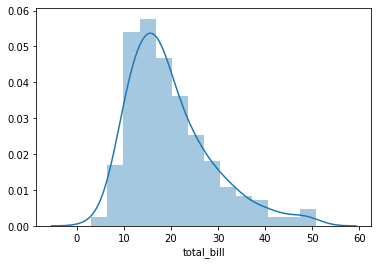
Distplot
The distplot shows the distribution of a univariate set of observations.
sns.distplot(tips['total_bill'])
<matplotlib.axes._subplots.AxesSubplot at 0x7f7abfd123d0>
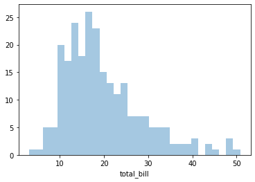
# To remove the kde layer and just have the histogram
sns.distplot(tips['total_bill'],kde=False,bins=30)
<matplotlib.axes._subplots.AxesSubplot at 0x7f7aa7b60150>
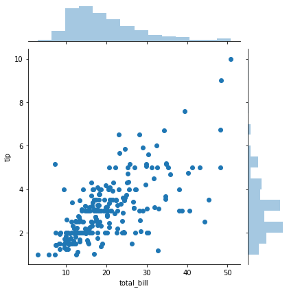
Jointplot
jointplot() allows you to basically match up two distplots for bivariate data. With your choice of what kind parameter to compare with:
“scatter”
“reg”
“resid”
“kde”
“hex”
Scatter
sns.jointplot(x='total_bill',y='tip',data=tips,kind='scatter')
<seaborn.axisgrid.JointGrid at 0x7f7aa7b55f90>
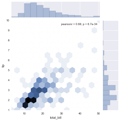
Hex
sns.jointplot(x='total_bill',y='tip',data=tips,kind='hex')
<seaborn.axisgrid.JointGrid at 0x11d96f160>
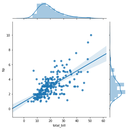
Regression
sns.jointplot(x='total_bill',y='tip',data=tips,kind='reg')
<seaborn.axisgrid.JointGrid at 0x7f7aa7bca790>
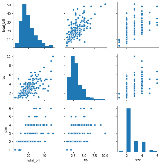
Pairplot
pairplot will plot pairwise relationships across an entire dataframe (for the numerical columns) and supports a color hue argument (for categorical columns).
sns.pairplot(tips)
<seaborn.axisgrid.PairGrid at 0x7f7aa5854090>
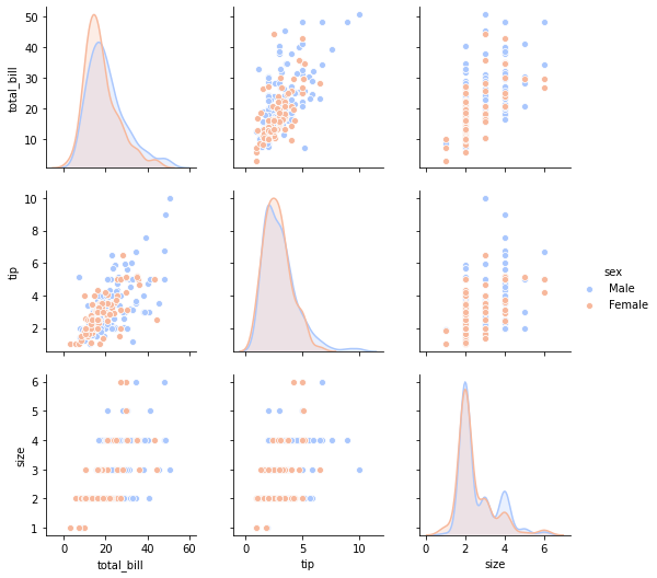
# separate by sex and color
sns.pairplot(tips,hue='sex',palette='coolwarm')
<seaborn.axisgrid.PairGrid at 0x7f7aa4cc10d0>
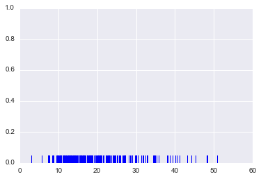
Rugplot
rugplots are actually a very simple concept, they just draw a dash mark for every point on a univariate distribution. They are the building block of a KDE plot
sns.rugplot(tips['total_bill'])
<matplotlib.axes._subplots.AxesSubplot at 0x1207c8b70>
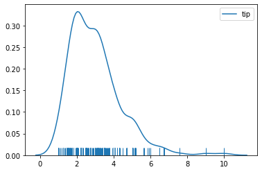
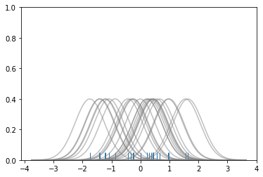
kdeplot
kdeplots are Kernel Density Estimation plots. These KDE plots replace every single observation with a Gaussian (Normal) distribution centered around that value. For example:
# Don't worry about understanding this code!
# It's just for the diagram below
import numpy as np
import matplotlib.pyplot as plt
from scipy import stats

#Create dataset
dataset = np.random.randn(25)

# Create another rugplot
sns.rugplot(dataset);

# Set up the x-axis for the plot
x_min = dataset.min() - 2
x_max = dataset.max() + 2

# 100 equally spaced points from x_min to x_max
x_axis = np.linspace(x_min,x_max,100)

# Set up the bandwidth, for info on this:
url = 'http://en.wikipedia.org/wiki/Kernel_density_estimation#Practical_estimation_of_the_bandwidth'

bandwidth = ((4*dataset.std()**5)/(3*len(dataset)))**.2


# Create an empty kernel list
kernel_list = []

# Plot each basis function
for data_point in dataset:

    # Create a kernel for each point and append to list
    kernel = stats.norm(data_point,bandwidth).pdf(x_axis)
    kernel_list.append(kernel)

    #Scale for plotting
    kernel = kernel / kernel.max()
    kernel = kernel * .4
    plt.plot(x_axis,kernel,color = 'grey',alpha=0.5)

plt.ylim(0,1)
(0.0, 1.0)
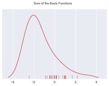
# To get the kde plot we can sum these basis functions.

# Plot the sum of the basis function
sum_of_kde = np.sum(kernel_list,axis=0)

# Plot figure
fig = plt.plot(x_axis,sum_of_kde,color='indianred')

# Add the initial rugplot
sns.rugplot(dataset,c = 'indianred')

# Get rid of y-tick marks
plt.yticks([])

# Set title
plt.suptitle("Sum of the Basis Functions")
<matplotlib.text.Text at 0x121c41da0>
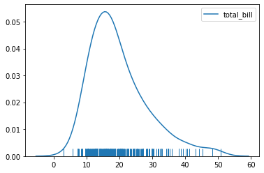
So with our tips dataset:
sns.kdeplot(tips['total_bill'])
sns.rugplot(tips['total_bill'])
<matplotlib.axes._subplots.AxesSubplot at 0x7f7a99ea4a50>
sns.kdeplot(tips['tip'])
sns.rugplot(tips['tip'])
<matplotlib.axes._subplots.AxesSubplot at 0x7f7a99e1fa90>